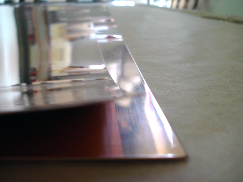

Copper Sheets
As I was going over some of my notes recently on Color Theory, these concepts stood out, as they relate to copper:
Design Relationships-
- Impact of depth perception
- Emphasis of contrast
- Sense of balance
- Psychological response of user
Color Characteristics–Visual sensations
- Emptiness of white-
- Darkness of black
. . . and there it was! The answer to my question “What do we love so much about copper?”
Copper lies right in the middle of that “emptiness of white & darkness of black” with its muted gold, deep orange, brown and rust tones. Copper fills that void of white emptiness and sheds a soft light, subtly reflecting its surroundings.

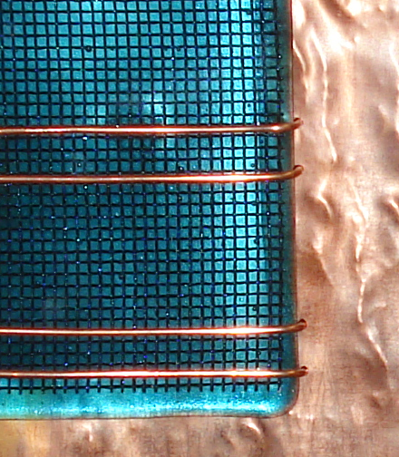
Copper Weave
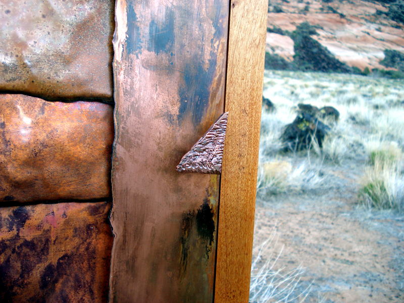
And this gives it depth and contrast– as a mixed media, copper blends well with water, wood, glass or steel, and colors from green to orange compliment its variations in tone.
Copperandglass
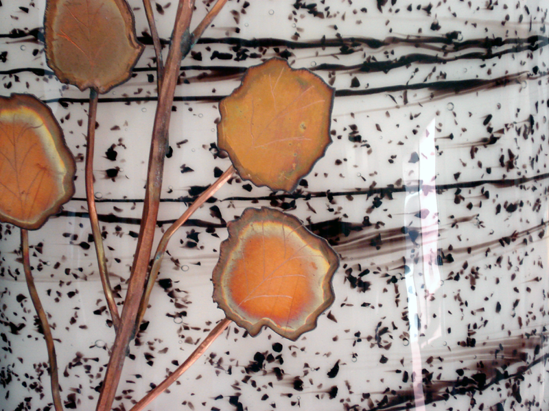
Copper Leaves on Glass Light
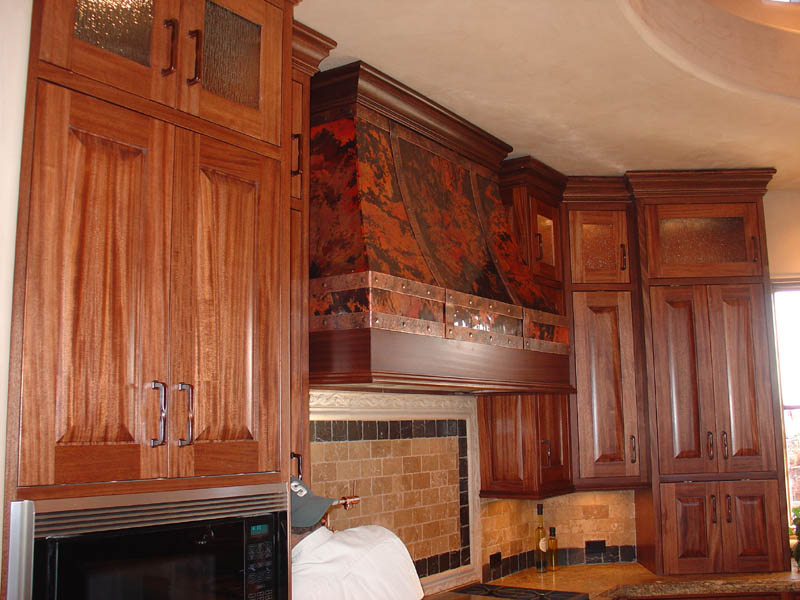
Copper Range Hood
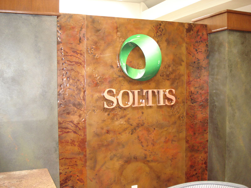
Local Business
There is balance –copper creates a sense of grounding. Maybe it’s the organic nature of the material or maybe it’s the tactile sense of the textures possible with copper.

Copper and Wood Art
All of these traits of the age old substance elicit something we connect to in its familiarity. Its warmth invites participation in a conversation- whether silent or shared openly. We love to be drawn into the shape, texture and focus of copper and have come to count on its calming aesthetics.
Copper in the Real World
What is it that you love the most about copper? Let us know in the comments below.